Abstract:Since the launch of the high-end new UI in the commercial version in October, it has caused widespread concern and response.
Since the launch of the high-end new UI in the commercial version in October, it has caused widespread concern and response. Now, Horion pushes the designer’s personality UI, including the original classic model and three theme UI, it can switch freely according to different scenes, different preferences, providing a variety of new, humanized choices.
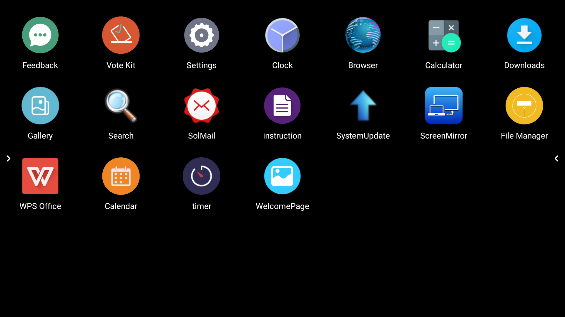
So how do you summon it?
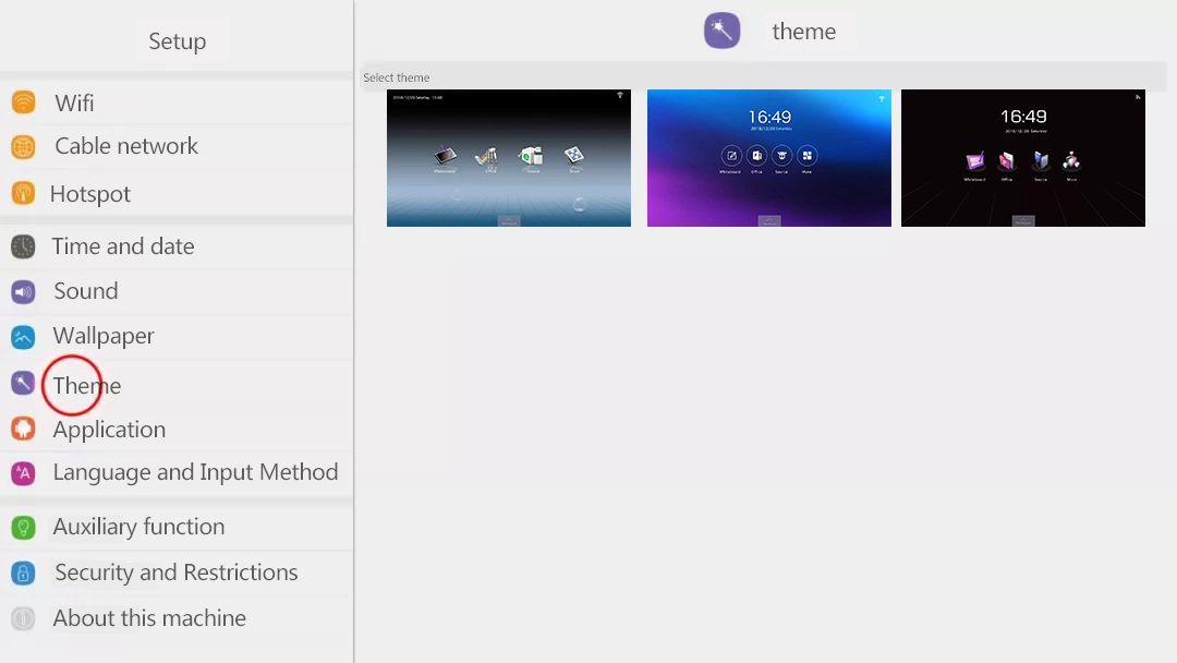
In the main interface, choose More. Go to the secondary sub-interface and click Settings.
(first step)

(the second step)
Click on the “Theme” option to see 3 theme UI choices on the right, click to select either.
(third step)
Horion has always been committed to creating a high-end conference image for the enterprise, which can be seen through the UI upgrade. This time, Horion mainly interprets different styles from three aspects: classic, business and personality. Under the conditions of objective factors such as different ages and style preferences, we will create a unique theme interface for consumers.
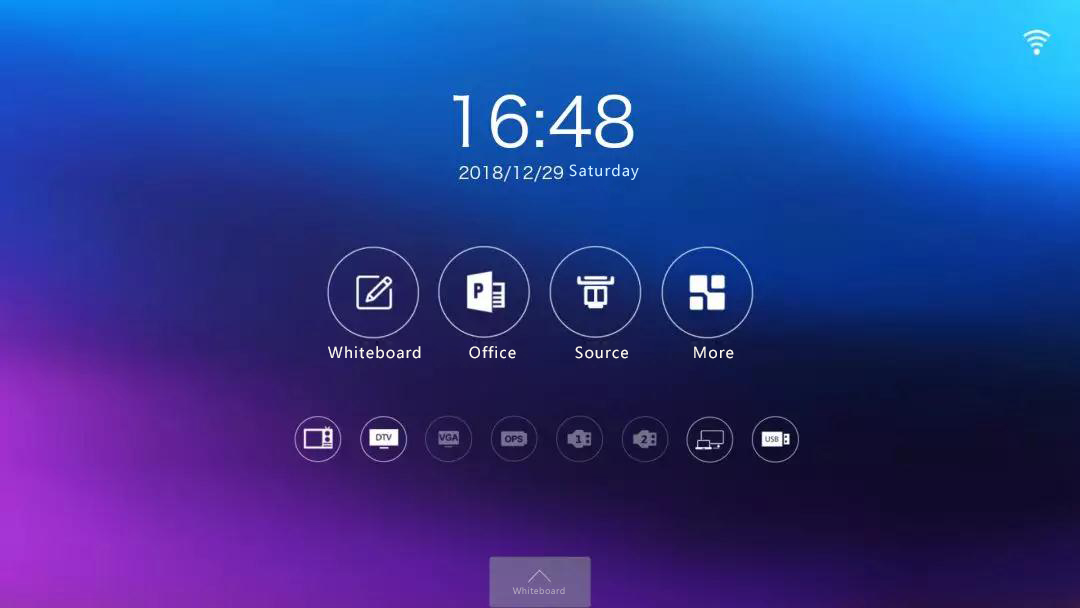
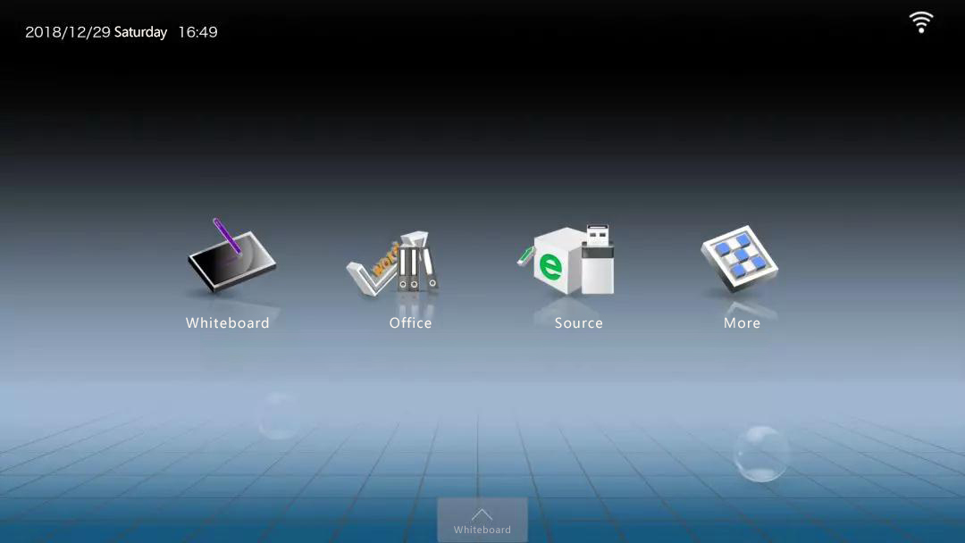
Simple classic
The entire main interface is based on the blue-violet color of the stars and sea. Flat design UI icon, with simple text, makes it more simple and generous.
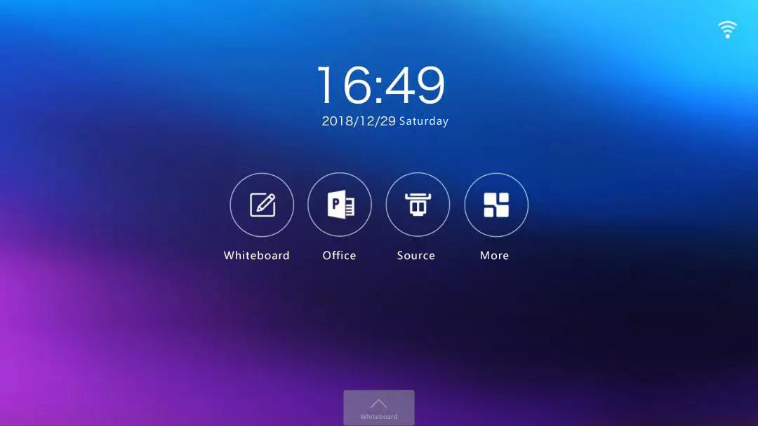
Restores the classic flat UI combination, providing a simplistic and interactive interactive visual experience. The simple UI represents its features, such as the combination of a pen and a whiteboard, and the Horion Interactive Flat Panel touch writing function.
Model business
Different from the classic UI interface, this UI icon design is mainly based on “pseudo-materialization”.
The background is a blue-gray style with a sense of space, concise yet detailed, and the depth of the grid effect will give people a space to imagine. On the main interface, the grid is the checkerboard, and the main function icon is suspended above the board. At the same time, the time display is placed in the upper left corner, and the coordination of the whole picture shows the sense of business ritual.
The eye-catching thing is that the visual effect is more matched with the body color and the base. The Horion Super Interactive Flat Panel has a deep gun color and is the same style as the dark gray interface with a sense of depth. It blends perfectly with the art of industrial products and shows the new image of Horion’s high-end conference.
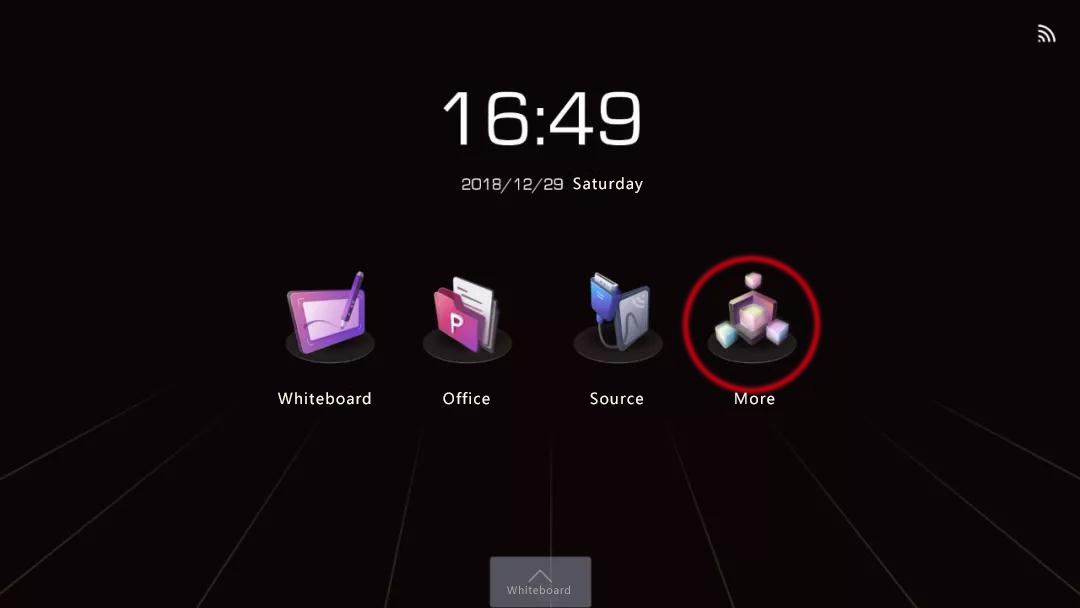
Designer personality
Different from the first two designs, this model focuses on young personality style. This design uses Microsoft’s latest Fluent Design design language to unify the interface icons.
The main interface is reflected in a dark background, which is unique in business situations. Extending from the 9 lines of virtual and real, combined with the lighting effects of the conference room, the lines are extended and the three-point perspective icons are combined to form a strong visual contrast of the hierarchical structure to reflect the visual difference of the spatial perspective dimension.
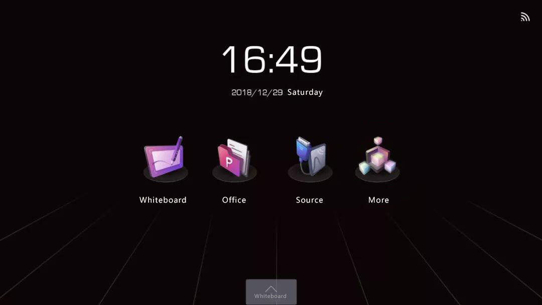
More importantly, each icon is tilted at 45 degrees. In the icon expression, each function option is embodied in a unique way.
Whiteboard: Combines the Horion smart large screen function with the product shape of the Horion brand smart stylus.
Office: Visualize the meaning of icons in folders and files.
Source: The image is extracted from the real HDMI interface, and the WIFI icon on the large screen can also indicate whether the wireless connection status of the same screen is performed.
More: The squares represent different functional modules in the system space, and the middle squares indicate that a module function has been selected.
What is especially striking is that in more choices, there have been considerable changes, breaking through the previous expression restrictions, all using stereoscopic icons. For example: on behalf of the search for capital “E” letters, clocks and clocks, etc., to establish depth and dimension, visual hierarchy. What is rare is that the rich color distribution of Horion brand makes the whole interface style uniform, highlighting the uniqueness and creating personalized visual effects.
Three different style UI theme interfaces for different scene needs and preferences. For example, in business presentations, corporate meetings and training scenarios, choosing different UI interfaces and displaying different corporate personalities coincides with the high-end image that Horion advocates to effectively solve the different scenarios of users.

Leave A Comment